09
Jan 2020
2020’s Pantone color of the year is classic blue, a rich and elegant tone which Pantone describes as reminiscent of “the sky at dusk.”
The color of the year is meant to encapsulate the year in design and inspire and influence trends in multiple industries. On a small-scale level, it can inspire you to explore new color tones that you haven’t tried before and bring life into your home.
We teamed up with Renee, our Store Manager in Acton and Alsu, a Design Consultant to create Classic Blue mood boards and discover what they love about the color.
Classic Blue: Calm, Confidence, and Connection
Pantone calls the color an “enduring blue” that instills “calm, confidence, and connection.” While it may not inspire those exact emotions for every person, it is, as Renee describes, “definitely a classic look.”
She describes the color as versatile, saying, “it fits into most styles; from very traditional all the way to ultra-contemporary.”
It’s also versatile in that it mixes with well with a number of colors, white and grey or orange, yellow, and pink. Alsu loves classic blue combined with yellow and gold. She explains, “There’s a lot you can do with this color.”
As far as how to incorporate the color into your home, the options are endless. You can do anything from wall color to cabinetry to a statement rug. Renee particularly loves it for a kitchen, either on cabinets or an island.
She also loves the idea of classic blue on a velvet fabric or Belgian linen on a sofa or chair. However, if you’re worried about your furniture looking clean, a blue fabric could show lint or dog hair. For a cleanable option, she suggests using the color on a leather.
One of the reasons both Renee and Alsu love the color of the year is its richness and its ability to blend beautifully with both cool and warm tones—it’s blue but it’s not cold.
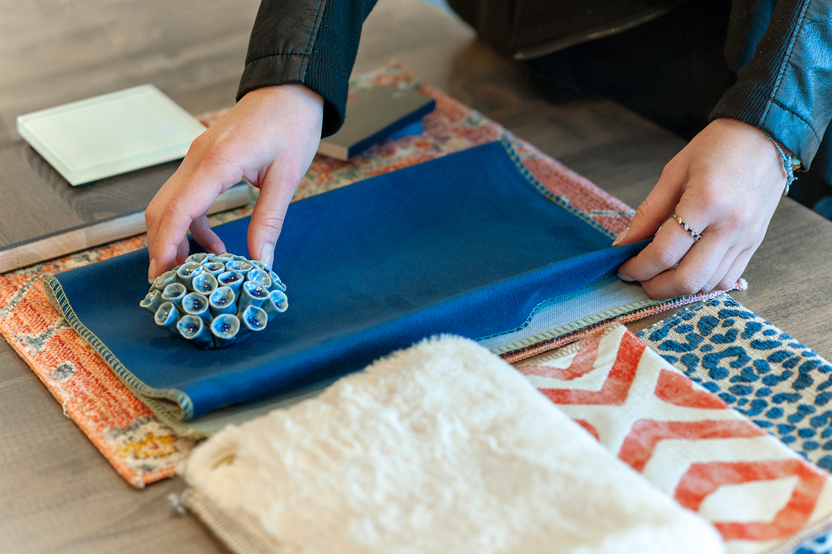
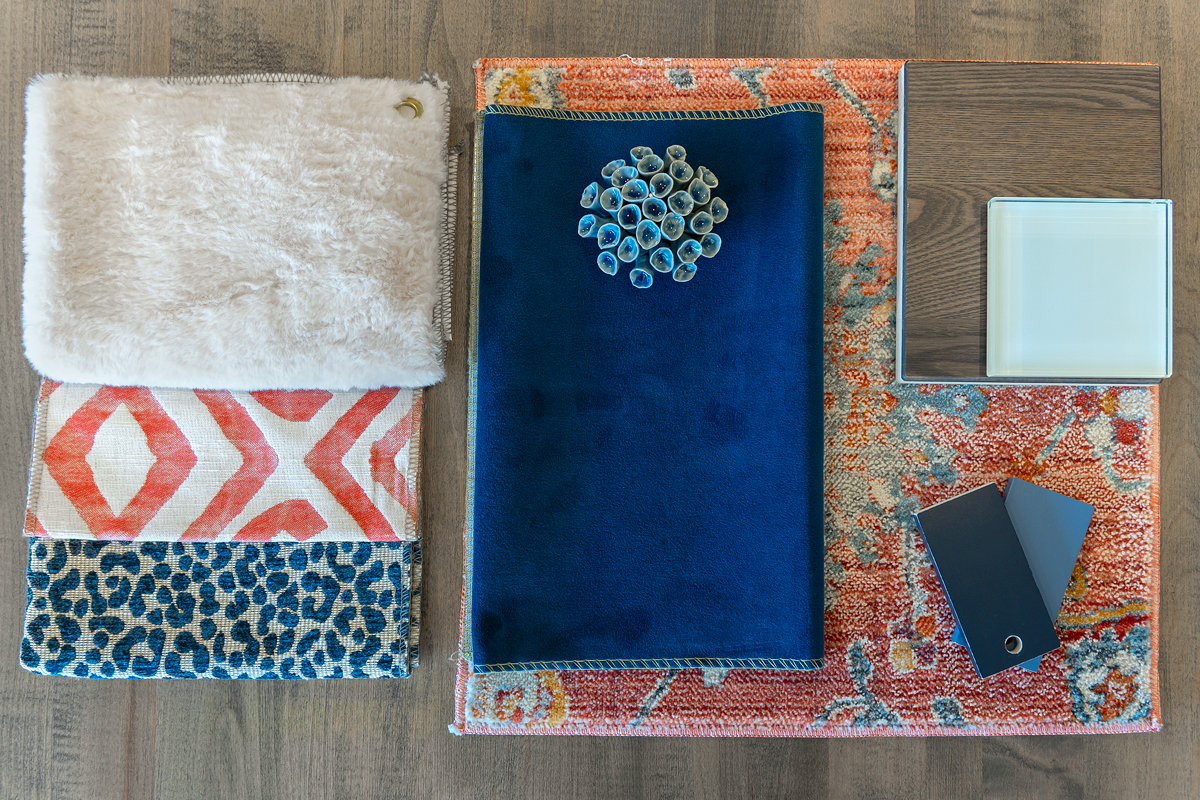
Renee’s board
When putting together her board, Renee started with a foundation of solid oak, textured wood. She says, “Textured woods are very in right now because scratches are less visible. I also love the darker tone on the floor for contrast.”
She decided to incorporate classic blue on the rug, mainly because she loved the silky, velvety texture. “It has a great reflection and the color on the ground is the most impactful, it’s the first thing that catches your eye when you walk in the room.”
For accents, she elevated the look with marble accents—for example, a marble fireplace or kitchen island.
She chose a “raw honey color” for the leather upholstery, to contrast the blue and bring warmth and richness to the overall look. Yellow is opposite on the color wheel from blue, making it a complementary and eye-catching choice.
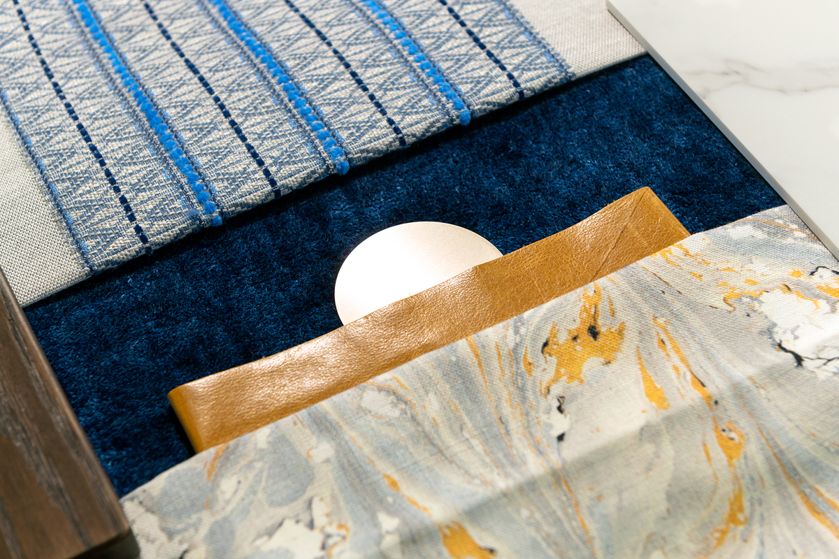
One of the many things she loves about classic blue is that you can add other shades of blue to it without it being overwhelming. She chose the striped, textured fabric with multiple shades of blue to add dimension and cohesiveness to the space.
Her other fabric choice has a watercolor effect; she describes it as having a “raw material look without being too contemporary.” For a unique application, it could be used as a wall treatment.
Finally, she completed the board with mineral metal as an accent. She says, “It’s not quite silver and not quite bronze, which makes it the perfect in-between neutral. I didn’t want to go too bronzy because of the warmth of the leather. It could be used on sconces, hardware, or a floor lamp.”
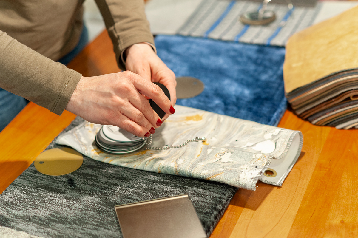
Alsu’s Board
Alsu took inspiration from natural elements and textured design to create her mood board, utilizing coral tones, multi-dimensional fabrics, and rich wood tones.
She says, “I chose the coral accents because I see a lot of sculptural and abstract pieces in interiors right now. I also wanted to incorporate living coral, last year’s color, into my board to show how warm and colorful you can make classic blue.”
She incorporated fluffy textured fabrics to add to the coziness of the design and paired her fabrics with a walnut wood tone to ground the space.
Translating the board to real life, she pictures an eclectic, contemporary space with a glass coffee table and a combination of several colors in the color palette—proving that there’s no need to shy away from color.
She also chose bigger, statement patterns on her fabrics to keep the space feeling modern and fresh.
Get inspired
Even if classic blue isn’t your cup of tea, we hope these boards display how different color palettes can completely change the mood and atmosphere of your home. You can go from sparse and minimalist to ornate and warm. Classic blue can look royal or modern, contemporary or traditional.
We encourage you to get inspired not just by Pantone’s color of the year, but by everything around you! You don’t have to look far to find inspiration—and winter is the perfect time to add color, texture, and life to your home.
Come into one of our showrooms to see what’s new, get inspired, and chat with one of our knowledgeable designers. They have years of experience creating detailed room plans so you can choose the colors and fabrics you love and create your dream home.
